
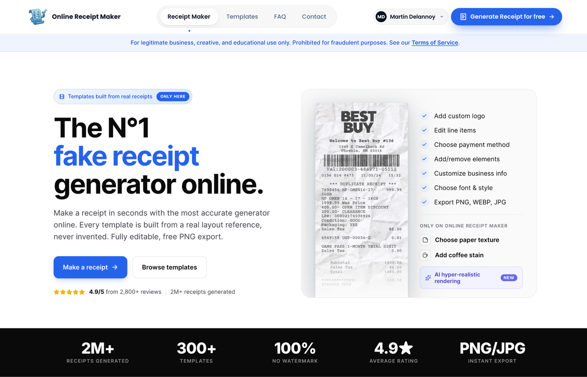
Hand two people the same generated receipt and one will accept it without a thought while the other spots it as fake in a second. The difference is rarely one big mistake. It is a handful of small details that a real receipt always gets right and a careless fake quietly gets wrong. Once you know what they are, you cannot unsee them, and you can make sure your own receipts have all of them. Here is the full anatomy of believability.
The typeface gives it away first
Real receipts come off thermal or dot matrix printers, which produce a specific look: monospaced, a little uneven, with a particular weight and spacing. A huge share of poor fakes use a clean modern proportional font, and that one choice quietly announces computer made. The eye registers it instantly even when the viewer cannot articulate why. A receipt that uses the correct typeface for the format is already most of the way to convincing, which is the main reason tools whose templates come from real scans start with such an advantage. The font is right by default instead of approximated.
The math has to reconcile
This is the single most common failure and the easiest to check. Subtotal plus tax must equal total. The tax figure must match the rate applied to the subtotal. The line items must sum to the subtotal. Plenty of fakes break here because someone edited a price and forgot to update the totals, or invented a tax number that does not add up. Anyone examining a receipt closely, an auditor, a sharp eyed viewer, a careful buyer, checks the arithmetic first. The fix is simple: use a tool that calculates the totals for you so they are always internally consistent.
Format details that brand the receipt
Here is the subtle layer. Every category of store has structural quirks a real receipt always includes and a generic fake usually omits. A coffee shop has a barista name, an order number and a rewards line. A gas station has a pump number and a price per gallon breakdown. An auto parts store has part numbers and often a core charge. A grocery store has loyalty savings and a high item count. A pharmacy has its own prescription and rewards formatting. A fake that is really one generic template with a different logo on top is missing all of this, which is exactly why it never looks quite right. The format is what makes a receipt recognisable as coming from that specific kind of business.
The barcode exposes amateurs
Real receipts carry barcodes and QR codes formatted to a chain’s internal system, with a specific digit structure. Hand made fakes often use a random block of stripes that encodes nothing plausible, and up close it is a dead giveaway. Convincing receipts use realistic, properly formatted barcodes, one of those details that is tedious to fake by hand but automatic in a purpose built tool.
This is where a scan based tool earns its keep. Online Receipt Maker builds each template from a real layout reference, so the font, the format details and the barcode are correct before you change a single field. You are editing reality rather than reconstructing it from memory.
Plausibility: the details that must hang together
Beyond formatting, a real receipt records a real event, and the particulars have to make sense. The store should sit at a plausible address with a store number in the chain’s format. The timestamp should fall within opening hours, because a slip stamped at three in the morning for a shop that closes at nine is a flag. Prices should match the date, since fuel and groceries shift over time and a stale price on a current receipt is wrong. And the items should suit the store, because a hardware product on a coffee shop receipt does not belong. These are the things a careful reviewer notices, and they are entirely within your control when you generate thoughtfully.
The physical layer, for printed receipts
If the receipt will exist on paper, the material matters as much as the content. Real thermal receipts have a faint sheen, a slight curl and ink that fades unevenly. A receipt printed flat on bright copy paper looks wrong even when every word is perfect.

Realism extras handle this. Tools like Fake Receipt Maker let you add thermal paper texture and the kind of wear that pushes a digital file toward something that reads as a physical object. A little imperfection is what authenticity actually looks like, and a receipt that is slightly creased or stained almost always reads as more real than a flawless one.
Why scan based beats invented
The thread running through all of this is the same. The convincing details are the ones a real receipt has and an invented one forgets. That is the entire case for starting from a real scan: the typeface, the format, the barcode and the structure are correct from the first moment, leaving you to vary only the content that should vary, the items, dates and totals.
A necessary note
Understanding what makes a receipt look real is genuinely useful for prop work, for design and, notably, for fraud awareness training, where recognising the tells is the whole point. It is worth being clear that these tools are for legitimate creative, business, educational and testing use, and that both sites prohibit using a realistic receipt to deceive anyone in an actual transaction. Knowing how the details work is a craft skill, nothing more.
Bottom line
A believable receipt is a stack of small correct decisions: the right font, math that reconciles, brand specific format details, a plausible barcode, sensible real world particulars and, on paper, a convincing physical texture. Generic tools miss several of these, while scan based ones get them right by default. Whether you are making a receipt or learning to spot a fake one, those details are the whole story.
